CoW: Cover of the Week 10/4/12
It's me again BI readers, Darryll 'YTC' Carter, with a brand new CoW: Cover of the Week. Typically I only talk about the cover bringing the Golden Udder home. But since I have been gone awhile; in honor of you all I will post three covers. And they are....
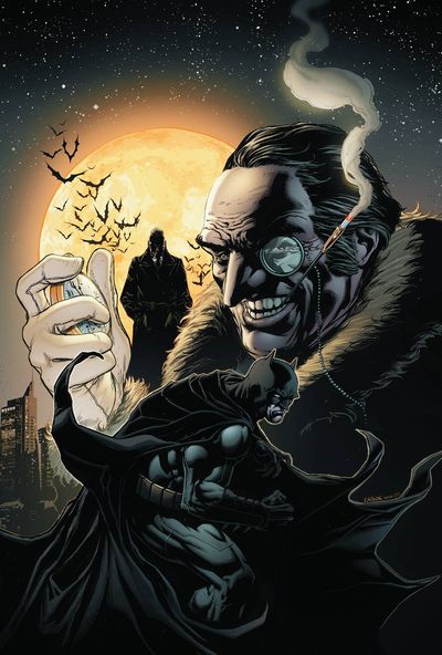
Detective Comics #13
(DC Comics)
Cover by Jason Fabok
This Detective Comics cover features the Caped Crusader himself and long time nuisance the Penguin. While the Penguin himself isn't particularly cause for alarm among us Batman readers, the actually layout of the cover is what caught my eye. It's just a nice classic compilation. The hero is in the foreground and the villain is leering over him. I presume that's Comissioner Gordon in the background accompanied by an ominous full moon and a small piece of the Gotham City skyline. It very effectively sets the tone, expertly standing by colors we associate with the night, mystery and the Dark Knight.
Spaceknights #1
(Marvel)
Cover by Chris Batista
This first issue of Spaceknights is on the list because of the nostalgia it created. I picked up the issue, looked it over and realized it reminded me of G-Force/Gatchaman. The hero busts in the foreground and then their alternate selves soaring through space in the background. Its neat. I really dig the yellow and blue suit in the center. One thing i did notice though, is that the armor they're wearing below is not the same as armors soaring above. There's probably a plot explanation for that.
 |
| GOLDEN UDDER WINNER |
Robyn Hood #1
(Zenescope)
Cover (C) by Stjepan Sejic
Last but certainly not least, in fact this is my favorite cover of week and the Golden Udder winner; Robyn Hood #1. I read the title of this book and saw the replaced the 'I' in Robin with a 'Y'. Then I saw that it was a Zenescope book and automatically concluded it would revolve around a female Robin Hood, which is bad-ass to say the least. There are three covers for this book. Cover A by Eric Basadula is pretty awesome. I love the fairytale feel of the cover that the colors bring out. Cover B by Greg Horn features some great art. But it lacks color and the imposing stature that Cover A brings.
Cover C is by far the best of the three. The painted feel of the colors seems more of a match for a Robin Hood tale. The action pose is stereotypical of Robin Hood and with that comes a bad-ass factor. When you add in the flaming arrow, the hint of a burning blaze in the foreground and the arrow in her mouth; you come out with a winner. I'm picking this up.


No comments:
Post a Comment