
Here we go:
ACTION COMICS
 Jake Estrada of Estrada Media in Melbourne, FL
Now this comic showed us a very young Superman that was out to take on the world in general. If you are bad, fat and out right rotten Superman is for the people here. He doesn’t take any crap, and he has the moves. I did love Rags Morales artwork, it was fresh, lavish and it gave us this boyish man that the people loved. Now we were also introduced to a Lex Luthor that worked for the government and had a clear disdain for Superman, and was willing to do anything to get his mark.
Wilson Sam of London, UK
With Action comics I was expecting great things with Grant Morrison,one of my favourite writers.And he did not disappoint.The first issue was a great solid read.This Superman was fun,young,righteous and cool.A cape,a T shirt,blue jeans and an attitude is what I got and I'm craving for more.It was a easy quick read but full of,well,action and Grant Morrisons witty banter.The train sequence was awesome.Rags Morales was on fire.Loved every panel,especially pages 4 and 5 where Superman is on top of the building.Mr Morales should have been a superstar.After this,he will be.Grant Morrison is having fun with Superman and so am i. More please.
ANIMAL MAN

Jake Estrada of Melbourne, FL
The opening of the issue was very engaging as it opened to a newspaper article giving you a brief of synopsis of Animal Man and what he has done. The artwork by Trevor Foreman was very powerful and engaging and it fit with the title well. It gave us an interesting take on a great character that was once written by Grant Morrison. Lemire has taken a page from Grant Morrison, and appears to be forging a very intriguing road here with Animal Man
G. Williams of Hamstead, NY
BATGIRL
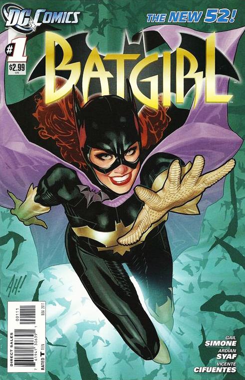 Derrick Jones of Brooklyn, NY
Probably the book that inspired the most upset ,outrage, and out and out fan emotion, Batgirl was always going to be a hard sell. Taking a beloved character a like Barbara Gordon and canceling out the history that turned her into the fan favorite techno goddess “Oracle” was a risky move bring her back to her Batgirl roots, but leave it to the talents of Gail Simone to turn lemons into lemonade, and what a sweet sweet flavor of lemonade it is.
Gail has written a story that is as kinetic as the Adrian Syaf’s artwork. She manages to fit in the main story, a introduction of our main character and some of her history. The art simply flows from page to page and I can’t stress enough that the panels have backgrounds. When you read these stories from a view of reviewing them it is amazing the things you see or rather what you don’t see. Batgirl is also one of the few NU52 that manages to feel that the story it’s told is a complete chapter to a story and that the story didn’t just stop because the writer ran out of pages.
Honestly this is in my opinion the best NU52 book that has come out so far and I plan on
sticking around to see how all this turns out.
Jake Estrada of Melbourne,FL
Now Batgirl was a great title. My initial things on the character was very low, but what made this interesting was that they kept the part where the Joker shot Barbara as canon and it made the story much more powerful. It gave us a brief explanation that she had gotten better, and that she was not back in action as Batgirl. It was fast and engaging and it kept me glued to the pages til the very end.
BATWING
CBC's Frankie Rodriguez of Vineland, NJ

Batwing was one of those titles that was mocked out. " look at his purple and green (blue) armor. Who is gonna want to pick that up," said a member of the J1 crew. Well, they changed the color of the armor (thank fully) and introduced us to a taste of David Zavimbe's world . . . and it's gore, dark . . . and cool. I want to know more about the Republic of Congo, David's life as a police office for Tinsha and more about Tinsha, Batwing's city, itself. And Ben Oliver is drawing the book of his career here. The realism to some of his picks are absolutely stunning.
Louis Laughton of Chicago, IL
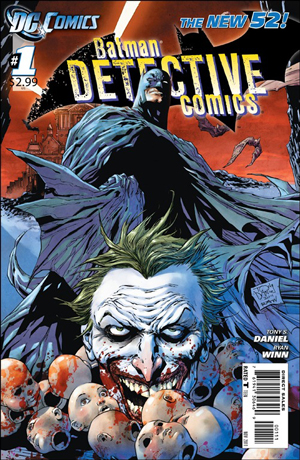
DETECTIVE COMICS
Jake Estrada of Melbourne, FL
The artwork was beautiful and it gave us the introduction of Batman and Joker at it again. Now the story felt kind of flat, but the art did help make the story move and kept my attention glued to the story the entire time to see what happened next. I will say this though there was very little detective here, just pure Batman fisticuffs’.
D. Jones of Brooklyn, NY
The art however is a different story, Dan Jurgens is not a “superstar” artist he is just great as his job. His characters have distinct looks and if everyone ran around the book naked you would still be able to tell them apart. Normally people mention the artist and ignore the inker but it is impossible to ignore George Perez’s inks backing up Dan Jurgens pencils, there like one of those great music duo’s from the 80’s.
While the art is good this was another one of those books that felt like the pacing was off and the writer felt that since the story would run over several books he could leave the writer in story free fall. The art will bring me back but the story is questionable.
G. Williams of Hamstead, NY
I've read Green Arrow. I didn't like it. I feel it is a major detraction from before. While I understand the original Green Arrow was similar to Batman. A millionaire using his money to fund his costumed adventures but now I felt like I was reading about Bruce and Oracle not Ollie and his new crew.
HAWK & DOVE
 D. Jones of Brooklyn, NY
It is almost impossible to review this book without bringing your own feelings about Rob
Liefield into the equation, this being Liefield’s return to a monthly book in many years. I will begin with the story, Sterling Gates writes a story that in itself is simplistic but that is not necessarily a bad thing with it being a first issue and a jumping on point to the “NU52”. Gates throws in the history of the characters and gives us a couple of mysteries to keep us coming back. I guess one of the most confusing things about the NU52 universe is that some things that came before in the old DC universe still exist but others don’t, so I guess we will have to wait and see what parts they kept.
Now back to the Rob Liefield and the art. I asked a couple of non-comic readers who don’t know the history of Mr. Liefield’s work. The words “cheesy”, “bland” and “boring”. To anyone familiar with the history you will be happy to know that Rob has learned to do hands and feet a lot better, but that is the about the best I can say. Body proportions are still off, Dove looks like a female body builder, and backgrounds are almost non-existent.
All in all this book is very reminiscent of the opening days of Image Comics where all the new books hit the stand like throwing paint up against the wall and seeing what stuck. For me the book had no distinct voice or brought anything new or exciting to the mix. Maybe that will change when the new creative team takes over (if his past is any indication the book will be late and then he will drop from it all together by issue 7). I say come back then for the real relaunch.
JUSTICE LEAGUE INTERNATIONAL
CBC's Frankie Rodriguez of Vineland, NJ
 I was a huge fan of the JLI when they first came to be and bought the entire original run from the late 80s and 90s. After a great series in JL: Generation Lost, I was wondering how this JLI would stack up. And GOD . . . it did such a great job. Jurgens comes back to some characters he knew very well but adds some new tweeks, letting Booster Gold be the leader that we saw back in JL: Generation Lost but even more confident. The cast had great voices that gave the team flavor and really gave it's international feel. Although, I ALREADY DO NOT LIKE GODIVA. I want to slap her. That . . . is good writing. The team got to together, several subplots were put into play and I loved Aaron Lopresti's pencils on the book.
 Truly, JLI seems to start off on the right foot and look forward to more.
Randall Grayson of Toronto, Canada
JLI, for me, ended up being a big disappointment. Seeing a team of heroes learn to work with one another on the fly could have been intriguing but writer Dan Jurgens presents a storyline without heart or wonder. You’d expect this part of a companywide relaunch to do something special with its cast of mostly D-list heroes. Aaron Lopresti’s art is at its best when the characters are in close-ups. The detailed, emotive facial expressions are vital to the dialogue-heavy storyline that’s filled with bickering. What you get is a shred of potential and a lot of disappointment. Unfortunate stereotypes abound with non-Americans speaking broken English and lots of ethnocentrism. Justice League International is an insipid comic with filled with uninspiring heroes with nothing worthwhile to offer, except assurance that its many forgettable superheroes are certain to remain forgettable.

MEN OF WAR
Jake Estrada of Melbourne, FL
This was a two for the price of one storyline. For 3.99 it packed a punch and it gave us a modern day Sgt. Rock, it showed us how everyday men are dealing with the superhuman around them and what they would do in this setting. It gave us a true human side to this brave new world that DC has unveiled.
I will say that Men of War surprised me. It was two well developed stories that seemed to give us a look at how real solders would deal with Writer Ivan Brandon keeps the super heroics to a minimum with just the one (or two shadows) while focusing on this new cast of characters . . . which includes a new version of Sgt. Rock. Not usually into war books but I have to admit that over all with both artists, this was a decent read.
O.M.A.C.
Candy Warren of Las Vegas, NV
 OMAC was just a bit too weird. I have a lot of respect as a fan of Jack Kirby but this just seemed weird. The main character is nothing more than a puppet. And while the story seemed okay . . . I am not so sure about it. Still . .. I am intrigued enough to want to know what will happen next but not sure if I am gonna buy it next month. The art was okay but it's Keith Giffen and I am used to his old stuff on Legion of Super Heroes.
Joseph Lester of Memphis, TN
OMAC #1 is awesome and manly. It’s a crazy, over the top, fight-filled story with Keith Giffen giving serious props to the work of Jack Kirby; who created OMAC back in the 70s. OMAC is a huge blue bruiser with a big mohawk. In this comic, OMAC breaks into the Cadmus Project and bashes his way a mile underground to a secret lab run by science fiction monsters. He punches them a lot.
By the end of the first issue readers are introduced to a whole ton of weird looking creatures and characters, learn that OMAC is a regular guy . . . a manly guy mind you . . . who gets hijacked by a force outside of his control, and met Brother Eye, a strange space-dwelling thing that seems to know just about everything in the world. It’s a potent mix of madness from back in the Silver Age.
STATIC SHOCK
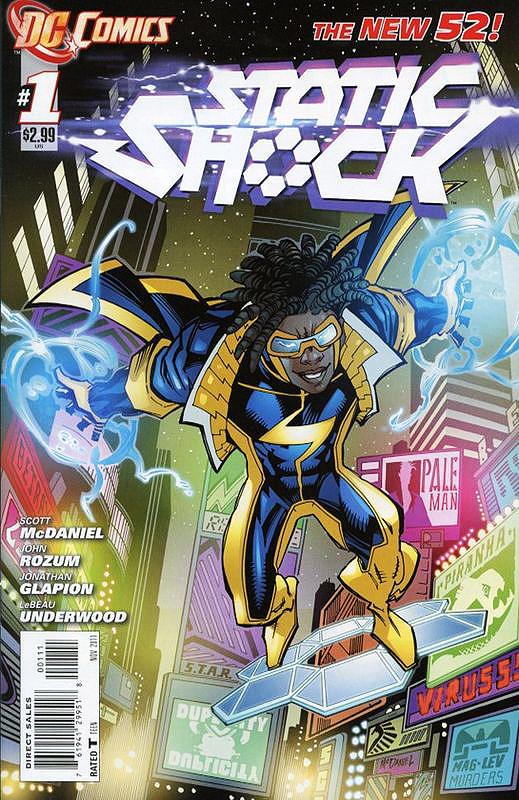 CBC's Hector Ramirez of Philadelphia, PA
So read Static Shock #1 last week, loved it. They have Hardware as his mentor he set Virgil up with his own secret HQ an internship with Star Labs and a background story to protect his secret identity. I’ve been a fan of Static since the cartoon on Kids WB and the changes they made aren’t so major that they make him unfamiliar if anything they make the character more interesting I’m definitely looking forward to following this series.
Wilson Sam of London, UK
I was a huge Milestone fan back in the day .I collected all the titles.With the untimely death of the late,great Dwayne McDuffie I was worried about the future of the Milestone characters.I was a bit sceptical with this 'Static Shock'.Well....it was a good read.Almost reminded me of the Static comics in the past.Virgil is a smart-alec genius who uses his brains to get out of trouble.His family is also an important factor of his life.I love the family interplay,especially with his sister.(sisters,bah).John Rozum is a Milestone writer from way back.For Milestone he wrote Xombi and Kobalt I guess Static is in good hands.The art,hmmm,was a bit too cartoony for my taste.Scott McDaniel can do better but if this is his new style hopefully I'll get use to it.A good read.Bring on issue 2.
STORMWATCH
Jake Estrada of Melbourne, FL

Now I loved the old Stormwatch and when it became the Authority in the original Wildstorm line. This series takes the old name, but uses the old Authority characters in this new world setting. The series threw a lot of plot lines at us, it showed us an angry moon that was willing to kill people and I loved it. I thought the pace was brisk and it had the action that made me what was going to happen next.
CBC's Frankie Rodriguez of Vineland, NJ
As a fan of both Stormwatch & the Authority, this was a joy when it was announced. Once I got this first issue . . . I was amazed. The characters fit seemlessly into the DC Universe. They established a major threat. Had introduced all the characters giving aspects of powers and personalities. Miguel Sepulvada's art was gorgeous, dark and filled with cinematic flair that grabs you and never lets go. Paul Cornell's script and characterizations were interesting, flavored and wonderful to read. I read this first issue TWICE in a row then another 3 times since I bought it. It is THAT good!
SWAMP THING
 Jake Estrada of Melbourne, FL
Now Swamp Thing had amazing art, it had an interesting storyline and it felt like a horror story where a man was at odds with his past, and was trying to forget who he was and what he could do. Of course the world did not forget him and it was crawling at him at every inch. The ending which was shocking and engrossing in the end will certainly have me racing back to the comic book shop for the second issue. Very powerful issue to say the least.
Louis Laughton of Chicago, IL
Despite Swamp Thing’s illustrious career, we really do know oh so very little about its human originator, botanist Alec Holland. We all know Swamp Thing had a lot of heart, but does the one inside the monster beat at the same pace as the one inside the man? We may never really know the answer to that. His memories have been colored with years of memories from his dubious existence as a vegetative avatar, with experiences that apparently still linger in his resurrected brain. All this makes him and us question which thoughts belong to him, and which are residue of the creature he can’t seem to leave behind. People have a conflicted reaction towards the unknown. The more foreign and unrecognizable something is, the more it plays upon our fears, but the more it also draws our curiosity.
Snyder works both emotions expertly, consistently offering ideas and scenes that disrupt the sense of familiarity we need for peace of mind. In other words, he’s getting very good at disturbing you, which may not be the most pleasant feeling in the world, but rather addictive all the same.Can we just straight out classify Paquette as a rising star among DC’s ranks of artists? The depth of his work gives such life to the characters that instead of seeming “drawn” or “cartoony” and therefore impervious to pain, they take on a sense of fragility. These characters can be damaged, and so you instantly feel tension for them. But beyond that, Paquette provides simply some of the most eerily beautiful imagery I’ve seen, pulsing from Fairbairn’s colors.
And those are all the opinions we have on the comics from September 7th. More books come out today (September 14th) and if you want to give your opinion to us, feel free to email us at either j1studio1@gmail.com or francisco.k.rodriguez@gmail.com . . . just have the title of which ever book you are reviewing from today or the next couple weeks in your email. If you do more than one title, feel free to mark it DCnU # 1 reviews. That is all for now. See you guys & gals next week with more on this historic event.
No comments:
Post a Comment